Don't Get Confused by the Confusion Matrix
A machine-learning model can be economically valuable while being “wrong” almost 70% of the time. This note shows why.
Imagine two analysts. Both claim 30% accuracy at picking REIT winners and losers.
The first one is uncanny at the extremes. When she calls a name a top performer, it usually is. When she calls one a laggard, it usually is. She's not always exactly right, but she's almost never embarrassingly wrong.
The second one is essentially guessing. He calls names randomly across the spectrum, and 30% of the time he happens to be correct.
On a traditional accuracy scoreboard, these two look indistinguishable. In practice, one would build you a portfolio. The other would build you a random portfolio.
This note is about how to tell them apart - and why the standard machine-learning diagnostic that's supposed to help, the confusion matrix, often makes things worse.
Why this matters in investing
In investing, being close matters enormously. A model that mistakes an excellent stock for a merely good one is doing useful work. A model that mistakes an excellent stock for a terrible one is not. Both errors count the same on an accuracy scoreboard. Neither error is the same in a portfolio.
That is the gap we need a different kind of diagnostic to see.
What is a confusion matrix?
A confusion matrix is a grid that compares what a model predicted against what actually happened. Rows are the truth, columns are the prediction. Each cell counts how many cases fell into that combination.
The diagonal (top-left to bottom-right) is where the model got it right - predicted equals truth. Everything else is a mistake. The shape of those mistakes - clustered near the diagonal or scattered everywhere - tells you what kind of model you have. Our model sorts REITs into five forward-return buckets, from C1 (worst predicted) to C5 (best). The matrices below have 25 cells.
What does the model actually look at?
A REIT machine-learning model is a function: feed it information about a trust at a point in time, and it outputs a forecast of where its forward return will land. The inputs ("features") fall into a few common categories:
-
Technicals: Market behaviour - momentum, volatility, moving-average crossovers, beta to the REIT index.
-
Balance sheet: Loan-to-value, debt maturity profile, interest coverage.
-
Operating fundamentals: FFO growth, occupancy, same-store NOI, lease-expiry profile.
-
Relative valuation: Dividend yield, price-to-NAV, valuation versus history.
The model in this note uses seven features, all drawn from the technicals category. It was trained on US-listed REITs through end-2022 and tested out-of-sample over the three years 2023 through 2025.
Example 1: the matrix that looks bad but isn't
This is the actual holdout confusion matrix from our 35-model ensemble. Rows are the true class; columns are the model's prediction. Darker shading means more concentration. The diagonal - exact matches - is highlighted.
Holdout confusion matrix - Arialgo REIT ensemble (6m forward returns, 72,116 predictions)
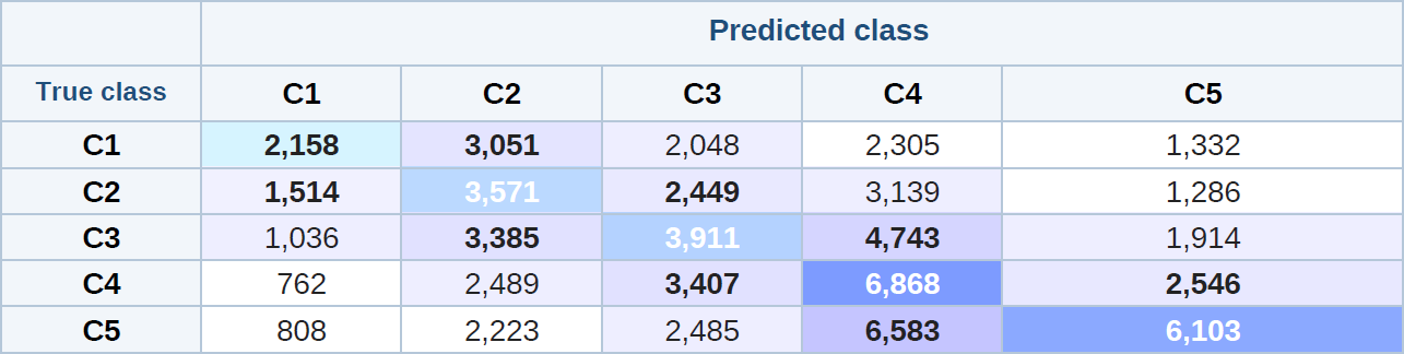
Mass is heaviest on the diagonal and stays close to it. The mistakes are mostly small mistakes.
Add up the diagonal - 2,158 + 3,571 + 3,911 + 6,868 + 6,103 - and the model is exactly right about 31% of the time. Five-class random guessing would be 20%. On its own, that doesn't sound thrilling. But look at where the model is wrong: about 70% of all predictions are within one bucket of the truth, and 88% are within two.
In plain terms: when the model is wrong, it is usually wrong by a single bucket - not by three or four. The average prediction misses the true bucket by 1.14 classes. Random guessing on five ordered classes would miss by 1.60. Most mistakes are small mistakes. The model is rarely embarrassingly wrong.
The chart that pays the bills
Here is the only chart that ultimately matters. Sort holdout names by what the model predicted, then look at what they actually returned over the next six months.
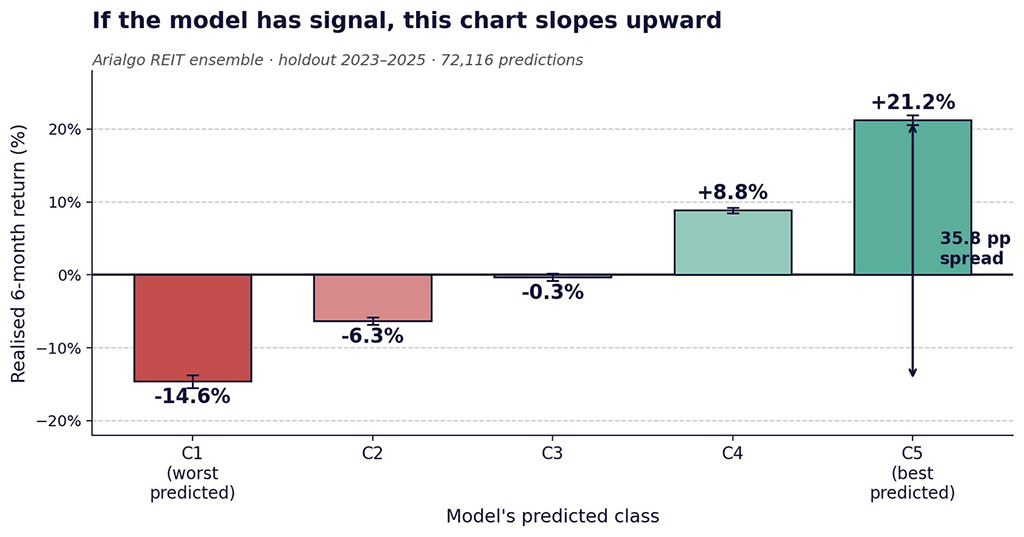
Realised six-month return by predicted class. Bars are bucket averages; error bars are 95% confidence intervals.
Class C1 (worst-rated) lost 14.6% on average over the following six months. Class C5 (best-rated) gained 21.2%. The spread is 35.8 percentage points - and the curve slopes cleanly upward across every bucket. That is what “31% accuracy” looks like when the errors are structured.
“If the curve slopes up, you have something. If it does not, you have a clean-looking confusion matrix and no edge.”
Example 2: the matrix that looks better but isn't
Now consider what the second analyst from our opening would produce: a model with the same overall distribution of predictions but no real ordering signal. We construct it by spreading each row's mass nearly uniformly across the five predicted classes, with a tiny diagonal bias:
Same row totals - but no ordering signal (illustrative baseline)
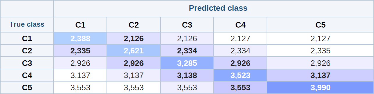
The mistakes are spread everywhere across each row - predictions don't track reality.
The diagonal here represents about 22% of all predictions - close enough to the real model's 31% that a quick skim might judge them comparable. But the average miss here is 1.60 classes - exactly random - versus 1.14 for the real model. Most mistakes here are large mistakes. The curve from this matrix would be flat: predicted-C1 names and predicted-C5 names would have roughly the same realized return. No edge, no portfolio, no signal.
The diagonal is not the test. What matters is whether the mistakes stay close to the diagonal - and whether the realised-return chart slopes upward.
The same principle appears in how the model is built. We train 35 models, each looking at only three of the seven features. Individually they are weak - the median single model produces a 27.6 percentage-point top-bottom spread. Averaged together, the ensemble produces 35.8 - about 8 percentage points of extra return from diversification alone.
Combining many weak signals beats relying on any one of them.
Three things to take away
-
For ordered outcomes - return buckets, credit grades, risk tiers - raw accuracy is the wrong yardstick. It treats “off by one” the same as “off by four.” Investing doesn't.
-
Read a confusion matrix as a pattern, not a number. What matters is whether the mistakes stay close to the diagonal. Heavy diagonal with mistakes clustered nearby is signal; heavy diagonal with mistakes everywhere is noise.
-
The chart that matters is realized return by predicted bucket. If it slopes up, you have something. If it doesn't, all the rest is decoration.